Midway Ventures Website
See the site live at: midwayvc.com. The site was developed in the Summer of 2018, and is intermittently updated.
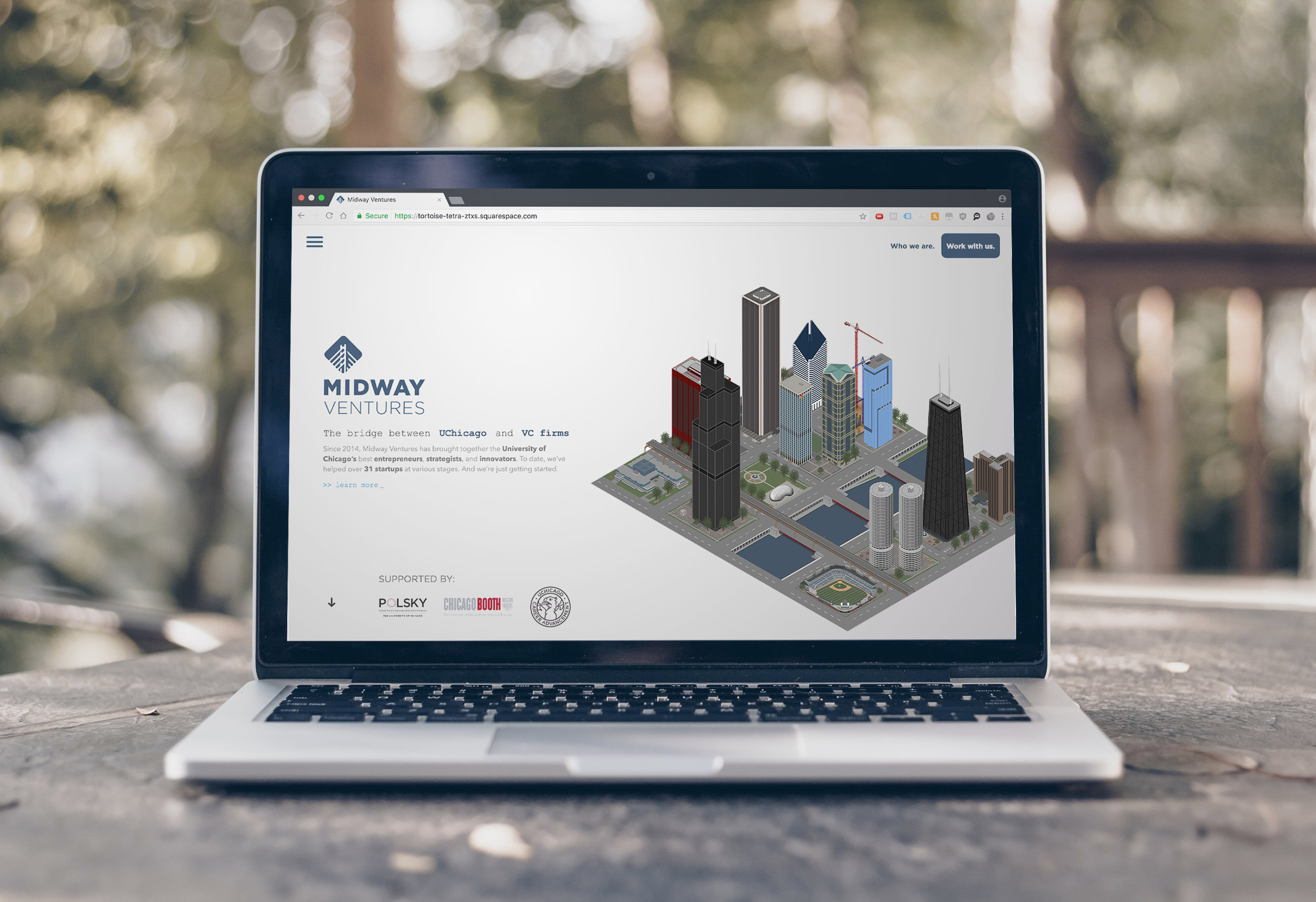
Before focusing more on front-end software engineering, I really enjoyed design. I find the separation between design and development as two different professions (in most companies) to be unnatural — developers can be great designers and vice versa. I designed and developed the Midway site entirely on my own, and I tried to highlight how the seamless integration of the two could create really fun products.
Midway Ventures was founded in 2014 as a student organization at the University of Chicago to help VC firms identify, diligence, and source promising student startups, and to work directly with startups on projects related to fundraising and business development.
That’s a long sentence haha, but we really do a lot.
Since then, we have collaborated with an array of diverse clients ranging from CPG skincare treatment, to food and beverage distribution, to electric vehicle transportation. We also organize events throughout the year to help undergraduates learn more about venture capital and early-stage startups.

I worked closely with Midway’s President at the time, Alex Rietveld, on a new website design. We believed a new site would help us to better engage undergraduate students and startup clients. Alex was in San Francisco for the summer, while I was between Chattanooga, Boston, and Chicago. We’d hop on Facetime calls in the evenings to hammer out the specs, go over bugs, and brainstorm features.

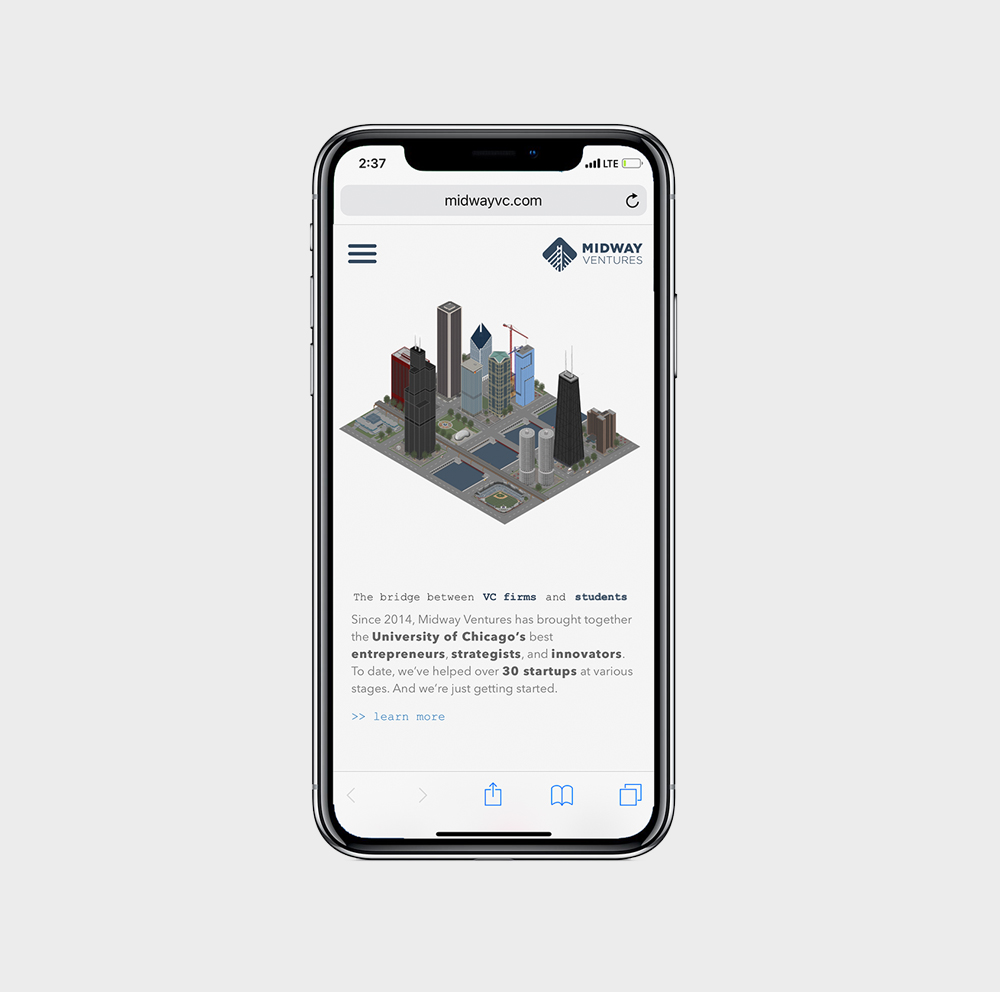
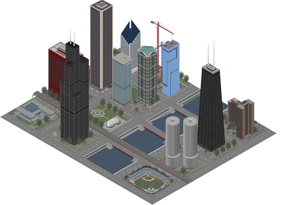
The custom Chicago graphic makes this website feel like its truly ours, comprised of nearly 10,000 individual layers in Photoshop painstakingly detailed. I hand-designed each building, from the University of Chicago Booth’s Harper Center, to Wrigley Field, to the skyscrapers lining the riverwalk. Multiple layers of .png files are stacked on top of each other alongside the animated sprites, which confers the 3D effect you see.

— Jason Barone, 'Why Squarespace' | 7:30
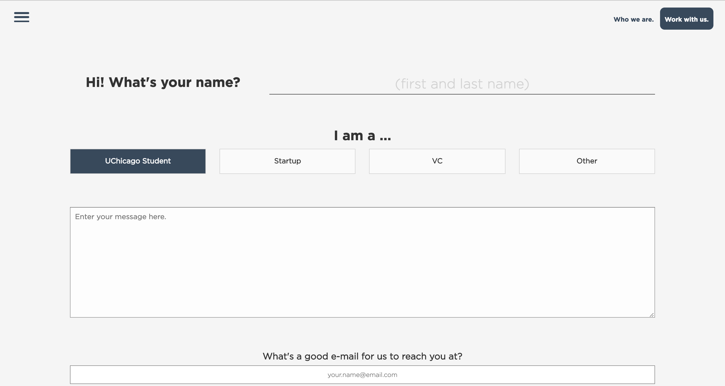
The maintainability of the website is its most important feature. I deliberately built it using the Squarespace Developer Platform (SDP), which enabled us to create a distinct and unique theme while still using Squarespace’s amazing CMS for gallery, blog, and event management. To achieve this, I learned how to integrate JSON-T into “.region” files unique to the SDP. The benefit is that now, even if you don’t know how to code, it’s easy to make content changes changes without needing to access the codebase. We also get to use Squaresepace’s great analytics tools to understand web traffic, which content is the most engaging, and how users interact with our site.
Like Jason Barone, I truly believe Squarespace’s CMS is the future of web design for SMBs that can’t afford professional developers.
The website ideally stays out of your way as much as possible. To achieve this, I had to think carefully about features like a disappearing navbar that follows user scroll and reappears on scroll-up, a minimalistic flat design, a disappearing hamburger menu, and image compression to improve load times (especially with the huge animated graphic on the landing page). A lot of the site’s content was made responsive using jQuery (for example, resizing the team gallery and client logos gallery, adjusting the DOM for mobile users, and resizing the animated sprites for mobile users. I learned a solid bit of Javascript along the way, which became a good basis for moving on to learning Javascript frameworks.
